


Did you know that every interaction you have with a product's website is comprehensively outlined by a UX Designer? The job of the designer is to enhance a user's satisfaction by improving accessibility, usability, and efficiency in a website. We all agree that in marketing visual beauty alters how we think and behave and, in this case, visual design can improve consumers' impressions before they physically have the product in front of them. To put it simply, we think attractive things work better. Luckily for those who have or who are exploring a degree in Web and Multimedia Design, the need for the skill will always be abundant... in addition to a handsome average salary of $90K!
With all of this in mind, here are some tips you can use to improve usability through better visual design:
Page Fold
Work with the fold. Anything that initially appears on the user's screen before scrolling is considered "above the fold." At first, you may feel that the page looks cropped when there is more content below the fold, but users perceive objects as being whole even when they are incomplete. People will naturally scroll past the page fold to complete the shapes they form in their minds. Another thing to remember is to be sure that the content fits a familiar shape or form, like a box or text block, so that users know what to anticipate after they scroll.
White Space
Less is more. Did you know that it's possible to put TOO MUCH content on your website? Don't get caught up trying to fill every available spot on your website. Having empty or "white space" on the page enables users to rest their eyes and process what they've seen.
Grid System
Have you ever visited a website where you took one look and felt a massive headache coming on? A website where the text is all over the place, the photos are randomly placed, and you can't make heads or tails of where you should look first? Chances are those websites were not designed using a grid system. A grid system is made up of vertical and horzontal lines which the designer uses as a guide for content placement. This keeps the site organized, easy to navigate, and visually pleasing. Check out sites like Foundation and 960.gs to explore different grid templates.

Consistency
People use prior knowledge to understand present things. They expect to see certain objects in specific places because of where they have seen them in the past. For example, the navigation should always be at the top or left side of your webpage. You may think that placing it on the right or on the bottom is creative and unique, but people are not used to navigating websites like that and will be confused and unwilling to explore your site further. Another common example is keeping the shopping cart at the top right corner of the site. Put it somewhere else and the user will give up trying to find it.
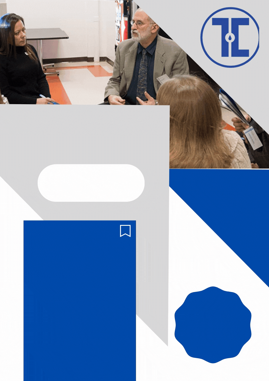
Designers must also be consistent within their individual sites. Buttons should generally be the same color, size, and shape as each other, or have some sort of visual similarity throughout the entire site. If one button does not look like the others the user will not know to click on it. The same goes with all titles, headings, and body paragraph styling. Being consistent in your designs will lead to fewer user mishaps, less confusion and more attractive websites. Take a look at the image below and notice the consistent color used for buttons.

Flat vs. Skeuomorphic Design
New word of the day: skeuomorphism. Skeuomorphism is a concept where a digital object is designed to look like the real-world object. For example, creating a button on screen that looks like a real life button. As technology moved toward fully digital interfaces using skeuomorphic design was important as it gave the user important clues as to the function of the object. If a button on screen looks like a real life button the user knows to click on it. While skeuomorphic design is still used, it has been toned down as we no longer need the same clues that users needed in the past since we have gotten used to navigating digital platforms. Users prefer things that are ordered, clean, and simple, so the current trend is to use flat design. Don't focus on heavy effects which can distract users from their purpose. Stay away from overuse of drop shadows, bevel & emboss, and over the top animations.

Functional Animations
When it comes to designing websites and apps, animation can be so much more than a "cute" factor. Yes, cute animations can engage the user and make your website more interesting (provided you don't go over-the-top with flashy and distracting content), but animations can also be used as a functional tool to make your interfaces easier to navigate and understand. Oftentimes on a website, you will click a button and something will change. If that change is unexpected you may have no idea what just happened or how to get back to where you were before. A functional animation will allow you to watch the change as it occurs and will give you an idea of what happened and how to navigate to wherever you would like to go next. A common example of a functional animation is a menu that slides in from the side of a mobile website or app. Instead of wondering why a list of webpages randomly appeared, the animation allows you to understand that you are still on the original page even though the navigation popped up and that it can easily be closed when you no longer require it.

Responsive Design
We've all experienced the frustration that comes from looking up a website on our phones that just isn't designed to be used on a mobile device. We find ourselves zooming in and out and scrolling, not only up and down, but also left and right. The text is difficult to read and the buttons are too small to tap. A website like that ensures that the user will never come back. Today we have so many different devices with different dimensions and we need to be sure that no matter which devices people are viewing our sites on, they will be able to use and navigate them easily. Utilizing the concept of responsive design, designers should create three different website layouts so that it can be viewed without difficulty on desktop computers, tablets, and phones.

By following these fundamental concepts as a UX Designer you will design a product that is pleasing and effective. A positive interaction with your website will lead to a positive association with your brand. These tips are a begginer's guideline to designing a website. Remember, rules are made to be broken. Many experienced designers know how to successfully break these rules and with a lot of learning and practice, one day you will too! Comment and let us know what you think about these tips!
For those of you who are interested in the Web and Multimedia Design field, check out how you can start your career with a degree from Touro Graduate School of Technology!

Looking for more helpful advice for your tech needs? Then check out firstsiteguide.com for more free online resources!
 Facebook
 Instagram
 LinkedIn
 YouTube